
Unlike some women in her generation, my maternal grandmother worked outside the home. Always. There was never a moment when she was a stay at home mother largely because my grandfather died before my father was born. Not a terribly independent person my nature, she didn’t have a choice, and she rose to what was a formidable challenge of single parenthood in the 50s. She’d work her entire life for a John Deere dealership. This meant many of our holiday gifts came from that storied American company with this green and yellow logo.
Enter Subway, who recently rebranded their stores in John Deere green and yellow. “Stores” is a stretch because the remodeled stores are really quite lovely. They kept the subway motif wall coverings that defined their earliest branding when they played on the concept of a literal subway. However, they added more comfortable seating and earthen tones on the walls and tables. Some stores even have a purring fireplace and plush sofa if you have more than 30 minutes to spare at lunch.
The logo, however, is pure John Deere. Is it me? Take a look.
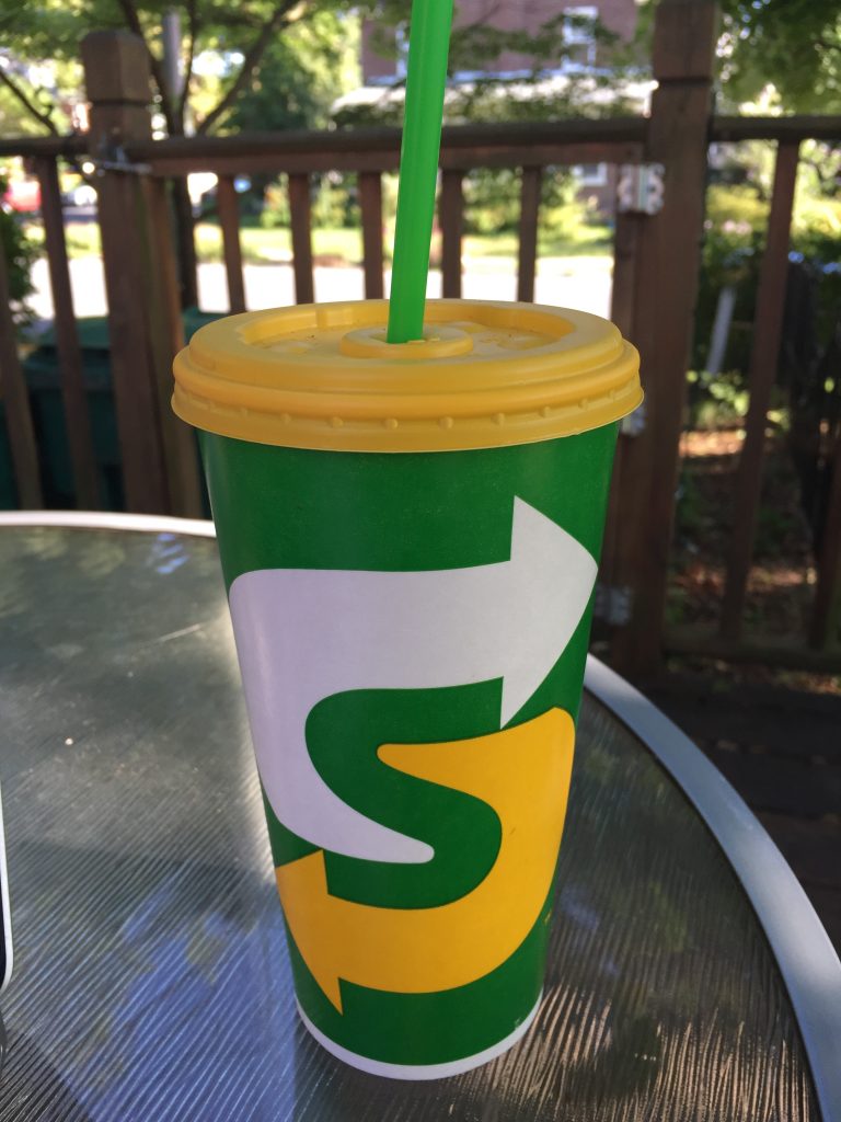
I can’t say I dislike it entirely. The “S” is encased in arrows, which references both the moving subway cars of the original brand and the speed the stores want to be known for. The yellow references the previous logo, which is usually a sound idea in a rebrand. The green is a natural fit for a store that bills itself as healthy eating and offers largely healthy fare, but did it have to be *that* green?
Some brands just own colors, and I think John Deere is one of them. I can eat in Subway without thinking of lawn mowers, but I do get a whiff of nostalgia every time I pick up their cup. The straw, I will admit, is just lovely.
July 30 Update: More on Subway’s stores via GD USA.