I’ve been designing for the past 20 years, so I have hundreds of projects to share. I’ve picked just a few to share here along with a little bit about the design process. I’ve completed this work while working as an in-house designer as well as for freelance clients. You can find more examples here: https://www.behance.net/cmrineer
Nutrify, LLC
I designed a logo, branding, and web site for Nutrify, LLC, a feed ingredient company. This company resells ingredients across the Northeast from a centralized warehouse. Early in the design process, the client referred to the warehouse as a “hub.” This “hub” comment was the inspiration behind the bright green three pronged hub that dots the “i” in “Nutrify.”
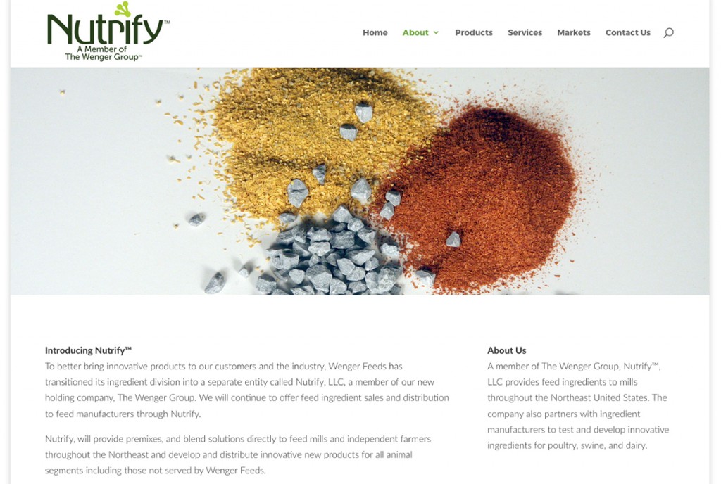
The web site for Nutrify includes some original product photography. Equipment used included a Canon 40D, ring light, and Photoshop. Web site copy was also written by the designer.
This was a very satisfying project to work on primarily because the client had a clear vision of the company and trusted the direction I took. Many times he would say things I was already thinking. It was deeply satisfying.
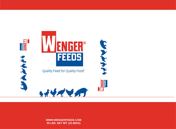
Wenger Feeds, LLC
Wenger Feeds, LLC is an established poultry and swine feed manufacturer with a rich history dating back to the 1940s. While I did not design the logo, I have worked extensively with the brand including building their brand identity, stationary, web site, marketing material, advertising, and product design.
Here is a feed bag that is used to package some bagged products. The bag’s contents and ingredient profile will appear on a feed tag that is sewn in the top. Therefore, this bag had to reflect the entire potential product offering including any species they might feed.
One thing I learned during this project, which was reinforced in subsequent projects, is that blue ink takes a long time to dry and can tend to transfer. The bag material was basically a newsprint paper. Early versions contained large areas of blue, but consultations with those that would move the bags in the warehouse led me to believe that if we used blue, there is a chance the ink would transfer to someone’s hands when they handled the bag. This is not the impression you want of your product. Since the minimum print run was 10,000 pieces, that is a lot of wasted material. Always involve the people who will use the product as they have valuable experience to share.
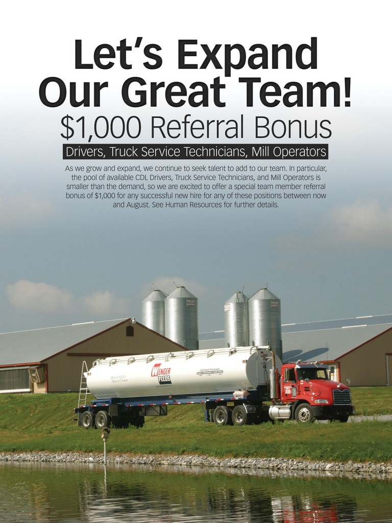
Also included on this page is a poster created for Wenger Feeds to announce an internal referral bonus. The photography and copy are also my work. This effort was also a collaboration because it was taken at a customer’s farm. The truck had to be washed and detailed for the shoot, and it required a truck driver’s time and expertise to maneuver it on the farm. Ultimately, this shoot led to photos I would use for years.