Idaho Candy for the Weird

I recently returned from a trip to Boise, Idaho. Although born and (mostly) raised on the East Coast, I lived in Boise as a child and for a year after graduate school. My parents returned to Boise in 1996 and have been there ever since. I visit every few years and always make a stop at Idaho Candy.

Idaho Candy is one of the few remaining independent candy companies in the country, and you don’t get to stay independent making knockoff Snicker’s bars or pseudo Kit Kats. Their candy is different and kind of odd. I adore it.

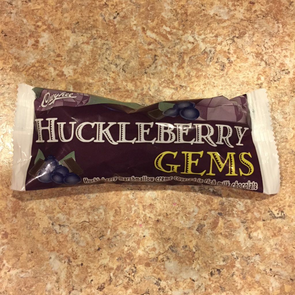
The signature bar is a Spud, “a wonderful combination of a light cocoa flavored, soft marshmallow center drenched with a dark chocolate coating and then sprinkled with coconut (Sorry, no potato!)”. Coconuts are a little like mushrooms and olives, you either love them or hate them. I’m in the former camp for all. They also make candy coated peanuts and a huckleberry candy bar, the huckleberry being well known in the area.

The original factory still resides downtown, and you can buy candy and t-shirts in their small store front. It’s old-timey and delightful.

If you want to learn more about Idaho Candy, how candy is sold and made, and independent candy companies in the US, I’d recommend Candy Freak by Steve Almond. Almond is currently known as the co-host of Dear Sugars, a podcast with Cheryl Strayed. I’d recommend it as well.

Even the packaging on the candy is old timey. I wouldn’t want it updated. It will never compete with MM Mars or Hershey so why try.


Some Brands Own Colors

Unlike some women in her generation, my maternal grandmother worked outside the home. Always. There was never a moment when she was a stay at home mother largely because my grandfather died before my father was born. Not a terribly independent person my nature, she didn’t have a choice, and she rose to what was a formidable challenge of single parenthood in the 50s. She’d work her entire life for a John Deere dealership. This meant many of our holiday gifts came from that storied American company with this green and yellow logo.

Enter Subway, who recently rebranded their stores in John Deere green and yellow. “Stores” is a stretch because the remodeled stores are really quite lovely. They kept the subway motif wall coverings that defined their earliest branding when they played on the concept of a literal subway.  However, they added more comfortable seating and earthen tones on the walls and tables. Some stores even have a purring fireplace and plush sofa if you have more than 30 minutes to spare at lunch.

The logo, however, is pure John Deere. Is it me? Take a look.

Subway's New Branding

I can’t say I dislike it entirely. The “S” is encased in arrows, which references both the moving subway cars of the original brand and the speed the stores want to be known for. The yellow references the previous logo, which is usually a sound idea in a rebrand. The green is a natural fit for a store that bills itself as healthy eating and offers largely healthy fare, but did it have to be *that* green?

Some brands just own colors, and I think John Deere is one of them. I can eat in Subway without thinking of lawn mowers, but I do get a whiff of nostalgia every time I pick up their cup. The straw, I will admit, is just lovely.

July 30 Update: More on Subway’s stores via GD USA.

The Press Hotel

I just returned from a trip to New England that started in Portland, ME. My husband and I did some quick math and figured out it had been 8 years since we stayed in Portland. The Press Hotel was our first stop. This hotel did not exist on our last visit, and I found it utterly charming. It was housed in the former home of the Portland Press Herald, the largest newspaper in Maine. It operated here until 2009. The decorators included some completely wonderful type and print references throughout the building to reference its history. Highly recommended. Tips: Use the valet parking. It really is cheaper and easier than parking your own ride. They sell the lovely cup pictured below, but at $30, I wasn’t willing to risk it breaking in my luggage on the flight home.

Press Hotel Mug
Custom made cups in the room was a beautiful touch.
Accent wallpaper with type
This accent wallpaper in the hall referenced Portland and Maine.
Type on a carpet
That’s not an optical illusion. The type falls off the wall and onto custom made carpet.
Hotel room number
Hotel room numbers were projected via a clever light fixture. ADA compliant signs are underneath.
Type embroidered on a chair
A bit of filler text embroidered on the back of the office chair.

Cherubs and their sweet packaging

While in London in September 2015, I thoroughly enjoyed the simple fried tomatoes our cafe served with breakfast. The little plum tomatoes were cut lengthwise and grilled with a little oil, salt, and pepper. It was the perfect acid to add to breakfast. When we returned, I started buying them and grilling them in a skillet on the weekends. The store usually carries a few lines of produce, but this package always catches my eye. The branding is on a sticker on top and resembles old poster art with hand drawn type. Check out the middle strokes in the “E” and “B.” Charming. You open the package by pulling the tab on the sticker and pour your product out like candy.  The underside of the sticker has a cheeky phrase, “If you were a salad, Nature Sweet Cherubs would be your best friends.”  The tomatoes are always uniform in size, and the clear package makes it easy to see what you’re buying. The cone shape may not stack well in a box, but it also provides more structural integrity than a plastic box. I rarely see one of these crushed while sitting on the shelf. Enjoy.

Cherub Tomatoes

Casper reigns at Penn Station

Mon mari and I spent last weekend in NY and traveled there via our preferred method of travel, Amtrak. Casper Mattress dominated the advertising space at Penn Station this month, and I had to admire their branding. Soothing shades of blue remind me of sleep and the font was playful yet modern. The original illustrations are just lovely and sometimes cheeky like a pile of bears sleeping with the tagline, “Hibernate.” Plus, a mail order mattress company seems like the perfect fit for urban dwelling New Yorkers.

A lovely illustration from Casper mattress. Source: their blog.