Slides for all

In mid-October, my husband and I began our regular visits to NYC to attend NY Jets games in nearby New Jersey. As usual, we booked a hotel within short walking distance of L’Express, our favorite breakfast haunt on 20th and Park Ave. 

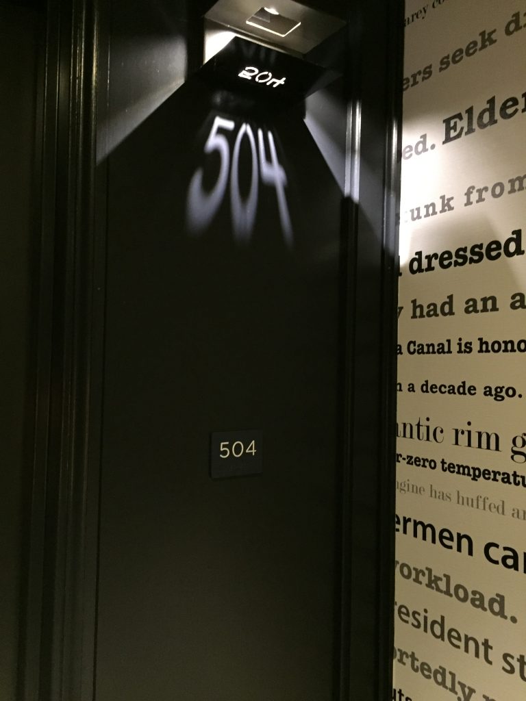
This week’s hotel choice was a new 42-story tower on 24th street. We were on the 10th floor, and therefore, had to take one of the four, later reduced to three, elevators in operation. 

When I’m on a lower floor, I just take the stairs. 

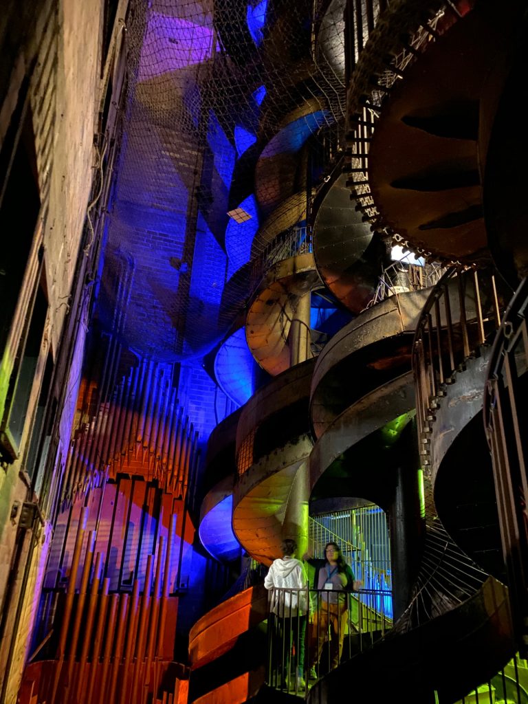
As we were waiting for an elevator down, it struck me how many stairs there would be in the event of a fire, and then I thought back to the City Museum in St. Louis. This hodgepodge isn’t really a museum so much as an interactive art installation, and one of their draws is a series of huge indoor slides that start near the roof. 

Could slides be installed to take fire evacuees to the ground level? I think you could build them to fit in a stairwell. Sure there would be some accidents, and you’d get a bit head of steam rolling if you went down 42 floors. However, you could also ensure that the handicapped and disabled could use them. They’re pretty easy to use, no explanation is required, you do not have to be propelled by legs or arms, and each floor could be attached to the main slide allowing entry at every level. 

Slides at the City Museum in St. Louis

Naomi’s Shoes

I am a complete sucker for sneakers. I love them. They’re my favorite thing to wear. I even have sneakers I just wear in my house – never outside. I generally like adidas the best. I think they’re the best quality. However, Nike’s design is always something to behold.

I’m really digging these new Nike Air Zoom Turbo designs. They were worn by Naomi Osaka at this year’s US Open. They retail for well over $100. I found this pair barely used on Poshmark for $20 + shipping.

Osaka collaborated with Nike on an entire collection including a version of these beauties that she’s wearing in Australia this season. Tennis Channel zoomed in on them during a warmup tournament. Look closely. The back of the sneakers is hair calf.

Sneaker Freaker has the full story. These were only available in Japan for Nike members. “Dressed predominantly in white, the upper is highlighted with a bright orange Swoosh and a playful graphic of Maneki Neko (a Japanese figurine of a cat believed to bring good luck) carrying a tennis racquet. Look at the heels and you’ll spot ‘Osaka’ in Japanese characters painted on an oval, gold coin-like patch, which nods to the koban coin often held by Maneki Neko. Another nod of the spiritual cat comes on the tongue in the form of a red belled collar and green scarf.”

These beauties were only available in Japan for Nike members.

Design and Election Season

I live in Pennsylvania, which means that this year I got to see what it was like to live in Iowa during primary season. Highways were backed up as the candidates visited, and I got mail. Tons of it.

There were some inspiring pieces, and I ended up using one as a template for a direct mail job that I designed. Incidentally, the campaign was very successful, so maybe those 8.5 by 11 in mailers work after all.

This piece in particular moved me. Inspiring subject and deft typography. Game recognize game.

Society of Illustrators Fall 2017 Shows

In November 2017, my husband and I went to New York City for a Jets Thursday Night game. We spent three days total and filled the first one with, among other things, a trip to the Society of Illustrators (128 E 63rd St, New York, NY 10065) for their fall show. The show, which featured children’s book illustrations, was due to officially open that night, so the two floors of framed illustrations didn’t all contain information about the author or the book involved. The majority of the placards were in a tiny pile on the lower level waiting to be installed. This actually added to the show because you really viewed the work disconnected from the book.

I asked a curator how book authors and illustrators are connected. She said that the illustrator was the author’s choice and that authors frequently had long standing relationships with artists. This made sense when you looked at the variety of styles evident in the illustrations. Some were hand drawn and others were digital. There was even some photography combined with illustration and some mixed media.

Society of Illustrators Fall Show - Children's book illustrations
How amazing is this? The placard wasn’t installed yet, so I have no idea who did it or why. It’s just fantastic by itself.

The second floor was a George Booth show. Booth was an illustrator best known for New Yorker cartoons and covers, and this show was small but lovely. The hand drawn comps were on display with no explanation. Again, art to be enjoyed for it’s own sake.

Waiting by George Booth
Waiting, a lovely New Yorker Cover by George Booth.

George Booth
This one made me laugh out loud.

What? George Booth
Wait for it…

The third floor was a restaurant and bar, the 128 Bar and Bistro, decorated with the society’s annual member show. The theme this year was “Food Fight”, and each artist interpreted it very differently. This was art created just for consideration for the show, not necessarily a commission.

This gallery was a reminder that there are places for talented artists that you might not expect. It also probably pays to network and build relationships with unlikely allies, like children’s book authors. Always keep your eyes open for potential projects.

128 Bar and Bistro
The 128 Bar and Bistro would be a lovely place to visit regardless of the shows available at the Society of Illustrators.

The Friendly Toast

Finding the world’s greatest breakfast place is usually my husband’s job when we are on vacation. Breakfast is very important to him, and since we often skip lunch, he wants something substantial and good. This sometimes means an uncomfortably long early morning walk or a dead end when we find the perfect place opens too late. (We’re early risers.) In New Hampshire, we found this nifty place in Portsmouth, The Friendly Toast. It turns out the Portsmouth location is the mother ship as this is a chain now has outposts in Boston (Back Bay) and Cambridge. The menu was eclectic and vegetarian friendly, which is important for us. I had veggie biscuits and gravy for the first time ever.  The decor is pure kitsch to match the menu and the groovy staff. You can check out their decor on their website under “Our Gallery of Goodness.” Highly recommended.

Table Decoration Kitsch galore at The Friendly Toast

The Press Hotel

I just returned from a trip to New England that started in Portland, ME. My husband and I did some quick math and figured out it had been 8 years since we stayed in Portland. The Press Hotel was our first stop. This hotel did not exist on our last visit, and I found it utterly charming. It was housed in the former home of the Portland Press Herald, the largest newspaper in Maine. It operated here until 2009. The decorators included some completely wonderful type and print references throughout the building to reference its history. Highly recommended. Tips: Use the valet parking. It really is cheaper and easier than parking your own ride. They sell the lovely cup pictured below, but at $30, I wasn’t willing to risk it breaking in my luggage on the flight home.

Press Hotel Mug
Custom made cups in the room was a beautiful touch.

Accent wallpaper with type
This accent wallpaper in the hall referenced Portland and Maine.

Type on a carpet
That’s not an optical illusion. The type falls off the wall and onto custom made carpet.

Hotel room number
Hotel room numbers were projected via a clever light fixture. ADA compliant signs are underneath.

Type embroidered on a chair
A bit of filler text embroidered on the back of the office chair.

A Little Spray Paint

This little seating area was in Portland, ME. Someone took a can of spray paint to some inexpensive chairs and created a lovely little outdoor space on a budget.

Gold chairs
Someone spray painted these chairs for a rather lovely effect.

Cherubs and their sweet packaging

While in London in September 2015, I thoroughly enjoyed the simple fried tomatoes our cafe served with breakfast. The little plum tomatoes were cut lengthwise and grilled with a little oil, salt, and pepper. It was the perfect acid to add to breakfast. When we returned, I started buying them and grilling them in a skillet on the weekends. The store usually carries a few lines of produce, but this package always catches my eye. The branding is on a sticker on top and resembles old poster art with hand drawn type. Check out the middle strokes in the “E” and “B.” Charming. You open the package by pulling the tab on the sticker and pour your product out like candy.  The underside of the sticker has a cheeky phrase, “If you were a salad, Nature Sweet Cherubs would be your best friends.”  The tomatoes are always uniform in size, and the clear package makes it easy to see what you’re buying. The cone shape may not stack well in a box, but it also provides more structural integrity than a plastic box. I rarely see one of these crushed while sitting on the shelf. Enjoy.

Cherub Tomatoes